Reclaiming Focus: Crafting A Unified Messaging Experience
How I redesigned a complex notification system to reduce user distraction and improve communication clarity, ultimately leading to a 15,000 increase in paid users in the first month.
No Time? Project at a glance!
Context: Autodesk Fusion’s notification system was fragmented, leading to user distraction, missed business opportunities, and development inefficiencies.
Key Metrics & Outcomes:
- User Impact: Reduced notification fatigue by 80% and improved clarity, enhancing user satisfaction and engagement.
- Business Impact: Achieved a measurable increase in paid subscribers through improved visibility of growth and marketing messages (15k in first month).
- Scalability: Developed a centralized notification framework integrated into Autodesk’s design system (Weave), ensuring consistency across teams.
- Cross-Team Enablement: Delivered reusable design patterns and documentation, empowering internal teams to implement notifications autonomously.
Role & Contributions:
- Lead UX Designer responsible for strategy, research, and execution.
- Spearheaded cross-functional collaboration with developers, product managers, and stakeholders across multiple teams.
- Positioned as the in-house notification expert, mentoring peers and driving alignment across Autodesk’s UX teams.
Autodesk Fusion is a cloud-based platform that unifies tools for 3D design (CAD), manufacturing (CAM), engineering (CAE), electronics (PCB), and product lifecycle management (PLM) into one seamless solution. It supports the entire end-to-end manufacturing process, including data management, collaboration, and workflows, enabling teams to innovate faster and manage every stage of production from concept to delivery.
Autodesk Fusion’s fragmented notification system was causing user distraction, missed business opportunities, and development inefficiencies. My leadership in design and strategy led to a comprehensive cleanup of notifications, the creation of a new notification center, and detailed design documentation for in-product messaging. The initiative not only refocused users and boosted paid subscriptions by 15,000 in the first month but also established me as Fusion’s in-house notification expert and mentor—shaping messaging standards, empowering teams, and influencing Autodesk’s design system.
Final Solution
My Role
As the lead UX designer, I was responsible for the project's launch, UX vision, and strategy, as well as overseeing user research and collaborating closely with a project manager (who joined later) and two developers. I also proactively gathered feedback from UX designers across other Autodesk teams to ensure broader alignment.
The Problem
Notifications were a non-standardized mess causing confusion, reduced growth opportunities, and a bad taste with customers, risking brand quality and customer loyalty.
The critical issues that current notifications caused were:
- User Experience: The inconsistent volume of notifications disrupted workflows, creating an overwhelming experience. Users struggled to prioritize information and efficiently manage in-app communication.
- Business Impact: Key communications, particularly those related to subscriber acquisition, were being lost in the noise, significantly reducing their impact on business goals.
- Product Perception: The lack of a cohesive notification experience detracted from the perceived quality and coherence of Autodesk Fusion, presenting an unpolished and fragmented appearance.
- Internal Friction: The absence of a unified notification strategy increased development complexity and led to redundant implementation efforts, making the notification system difficult to manage and evolve.
Project Goals
The primary objective was to transform Fusion's messaging system from a source of frustration into a strategic asset. I defined two key goals:
- User Goal: Significantly reduce notification fatigue and distraction by creating a clear, consistent, and predictable system for receiving and managing messages.
- Business Goal: Increase the visibility and effectiveness of critical communications, especially growth messaging.
📈 Impact
The new notification system significantly addressed a critical need within Fusion, quickly establishing me as the in-house notification expert and mentor. My solutions and guidance became a key resource for fellow UX Designers, with weekly consultations to address in-product messaging questions across various new features and products. This initiative delivered significant results, including:
- Enhanced visibility and effectiveness of growth and marketing messages, directly contributing to a measurable increase of 15,000 paid subscribers in the first month.
- Establishment of a scalable and maintainable messaging framework, streamlining product development and ensuring consistency.
- Provision of clear design patterns and documentation, empowering internal teams to implement notifications effectively and autonomously.
- Influence on Autodesk's design system, with key elements of my work and features incorporated into a new component within Weave (Autodesk's Design System).
Process
Discovery
Recognizing Fusion's fragmented messaging hurt user engagement, I initiated an investigation. Analytics revealed that banner notifications were frequently ignored, a trend supported by anecdotal feedback and peer discussions. This evidence underscored the need for a unified notification strategy.
To tackle this, I first conducted a thorough content inventory of existing notifications. I began the process independently, then engaged colleagues from UX and Development through Mural to gain diverse insights. Using affinity mapping, I organized the notifications into groups, uncovering patterns and inconsistencies—such as duplicate alerts and varying importance levels.

To establish a solid foundation, I reviewed the Autodesk Design System (Weave) and noted unclear usage guidelines for notifications. I also examined notification strategies from internal products like AutoCAD and Revit, as well as external applications, to identify best practices and innovative solutions.
My research covered all notification types—emails, canvas alerts, job statuses, OS notifications (which analytics showed were underutilized and inconsistent, so we decided to remove), and in-line messages—to ensure a holistic approach. This helped look at notifications from a holistic POV to really figure out where best to first tackle notifications and to consider broader strategies in the future.
User Research
I began exploring this problem during prior user research conducted for other projects, particularly as I observed how users interacted with notifications. To deepen my understanding, I reviewed user forums, analyzed existing research documented in the project wiki, and consulted with other UX designers who had firsthand experience engaging with users on this topic. Additionally, I actively participated in discussions on the Fusion forums to gather direct insights from users about their experiences with notifications.
Through this process, I identified several recurring frustrations users face with notifications, including:
- Overuse/Repetition
- Bad content
- Easy access issues
- Lack of user control
- Too many channels
Framework Development & Research
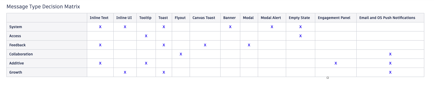
At this point, I paused to consider different perspectives on notifications. One approach was factoring in severity—the intersection of importance and time sensitivity—which guided me in choosing the ideal delivery methods. From this, I created a severity matrix that helped prioritize and categorize notification types.
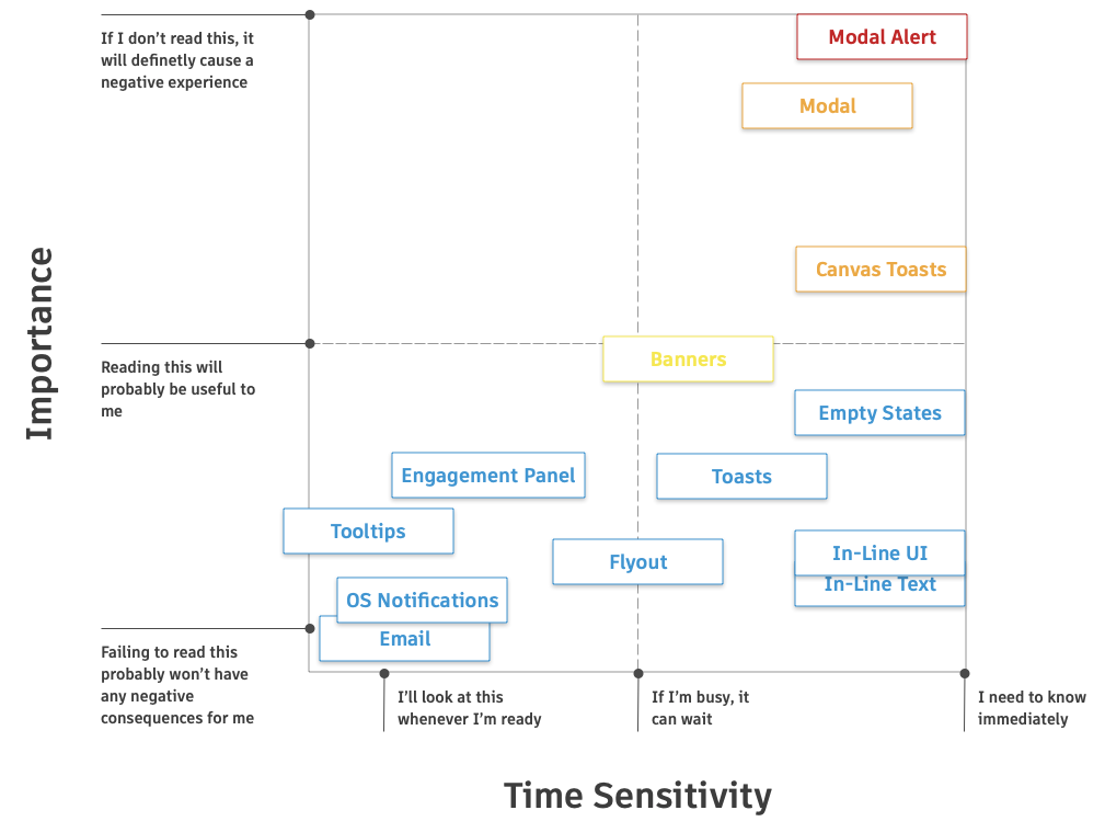
Building on the affinity mapping done earlier, I identified six notification categories, then used a Decision Matrix (informed by the severity matrix) to align each category with the most appropriate delivery method:
Although these guidelines were preliminary, they established a solid starting point for testing, feedback, and ongoing refinement. Continued field testing and iteration would be necessary to ensure their effectiveness.
Getting Stakeholder Engagement Buy-in
To secure funding from the Growth Business group, I developed and delivered a compelling presentation to leadership, effectively securing buy-in by showcasing the project's strategic value. It emphasized how resolving the notification issues would directly benefit both users and the business, particularly in growth and marketing. Specifically, user research indicated that excessive notifications, especially banner notifications, were causing users to miss important information.
Design and Iteration
The Notification Center began as a complex concept, but through rapid sketching, prototyping, and feedback, I transformed it into a simple, scalable solution. I quickly transitioned from sketches to high-fidelity designs using existing design system components and auto layout, which allowed me to iterate faster and gather more actionable feedback. This approach helped me establish a clear and effective strategy to solve user challenges.
Defining the Solution
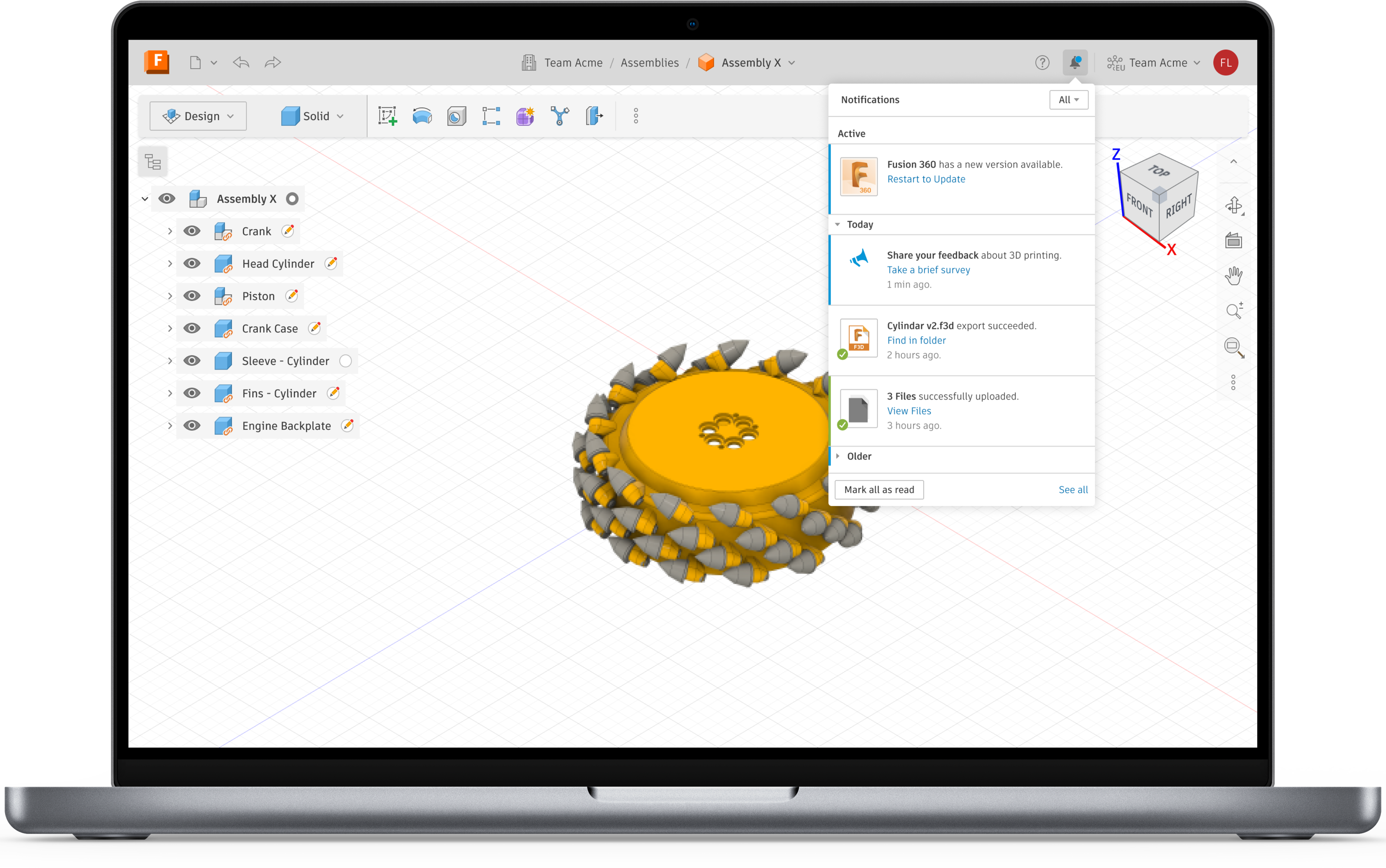
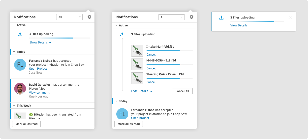
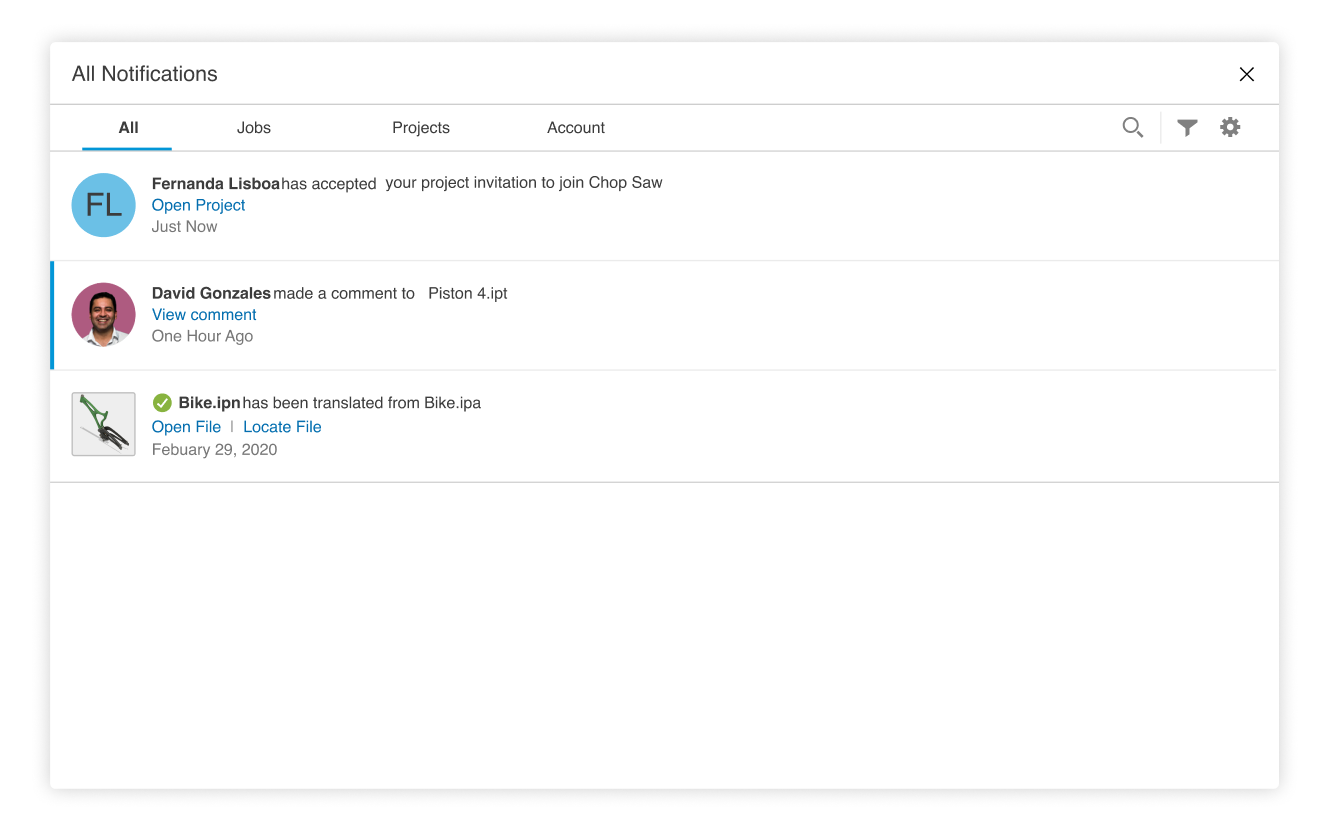
Weave provided two components: the notification flyout and the toast. My research revealed the need for a unified "Notification Center" that combined these elements into a centralized hub. This solution allowed users to access all notifications, including previously dismissed toasts, addressing the common frustration of missed alerts.
To optimize the user experience:
- High-severity notifications were shown as toasts for immediate visibility.
- Less critical messages were stored in the flyout with a blue dot indicator.
-
Intermediate messages:
- Appeared briefly as a toast.
- Dismissed after 3 seconds.
- Moved to the flyout with a blue dot indicator.
This separation reduced workflow disruptions, allowing users to focus on critical tasks while reviewing less urgent messages later.
Feature Exploration
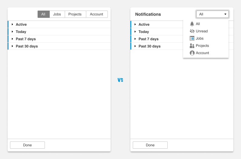
- Filtering and Settings: Users could filter notifications by type, status (read/unread), and other criteria, offering greater control and customization.
- Collapsible Sections: Notifications were grouped by time using accordions, with read markers indicating unread notifications for quick identification.
- Bulk Actions: Right-click functionality enabled users to clear all notifications within a group, simplifying bulk management.
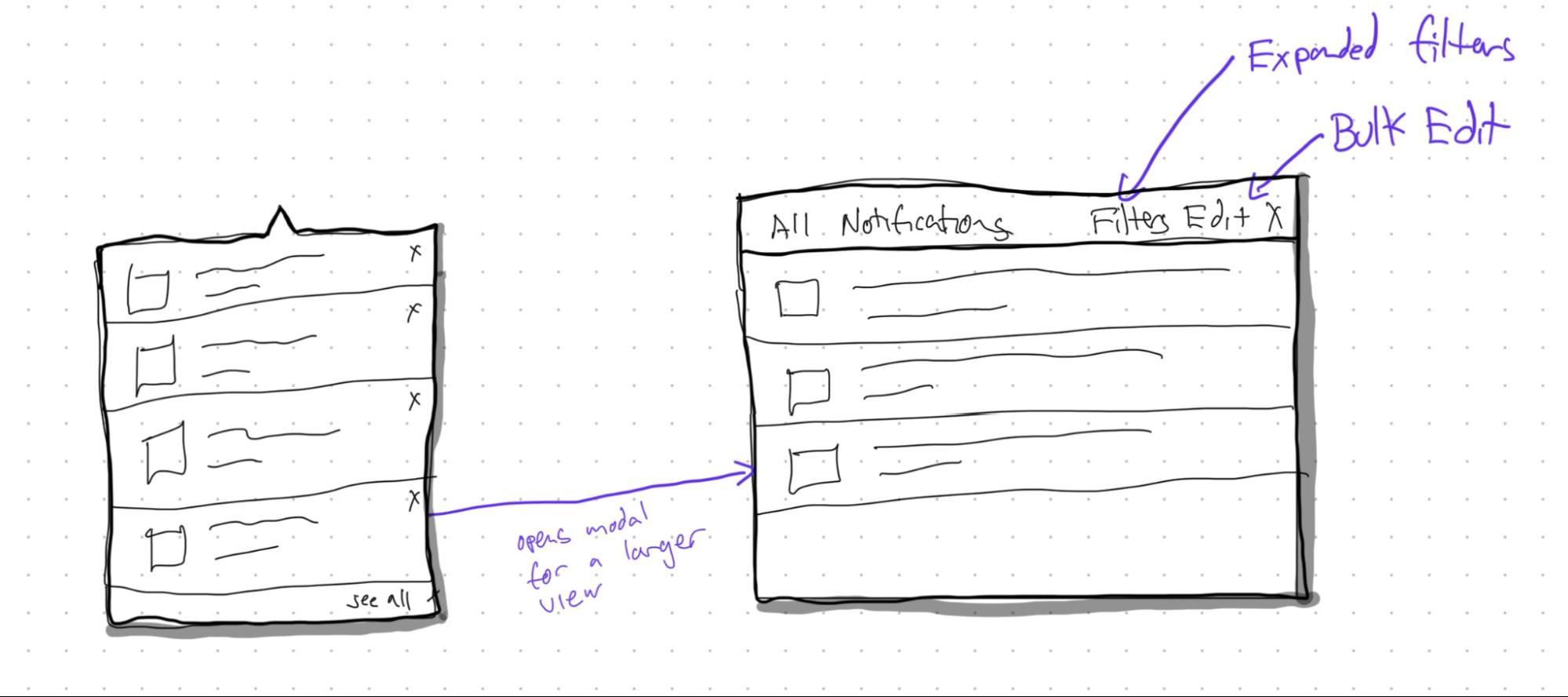
- "See All" View: An expanded view provided a detailed overview of notifications for deeper exploration.
Design Challenges and Decisions
- Filter Design: While tabs initially seemed intuitive, they were not scalable for adding future filters. A dropdown filter was chosen for flexibility and future-proofing.
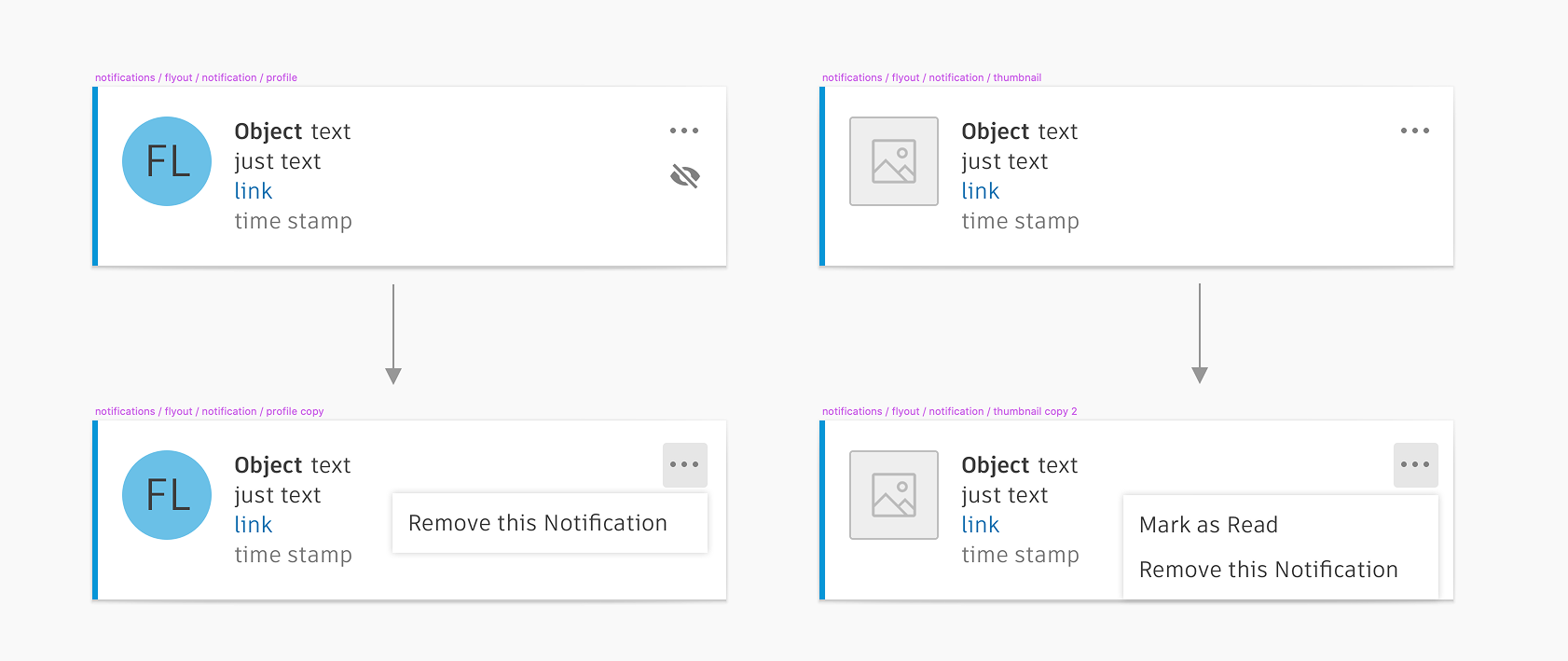
- Visual Clarity: To improve scannability, I incorporated consistent iconography, thumbnails for files, and profile pictures for user-generated notifications. Contextual icons (e.g., error, success, or warning) were overlaid on notification imagery, enabling users to quickly assess relevance and urgency.
- Grouping by Time: Time was the most critical factor for organizing notifications. Using accordions allowed users to scan updates efficiently while keeping the interface clean.
Iteration and Feedback
The design process was highly iterative and feedback-driven. I tested and refined features like grouping, filtering, and visual elements based on stakeholder input. Internal feedback helped me identify opportunities to streamline interactions, ensuring the final design balanced simplicity, scalability, and user needs.
User Testing
We conducted usability sessions to evaluate Fusion's current notification system and validate the new Notification Center. These sessions combined user research and usability testing, making up for not having a separate kickoff research.
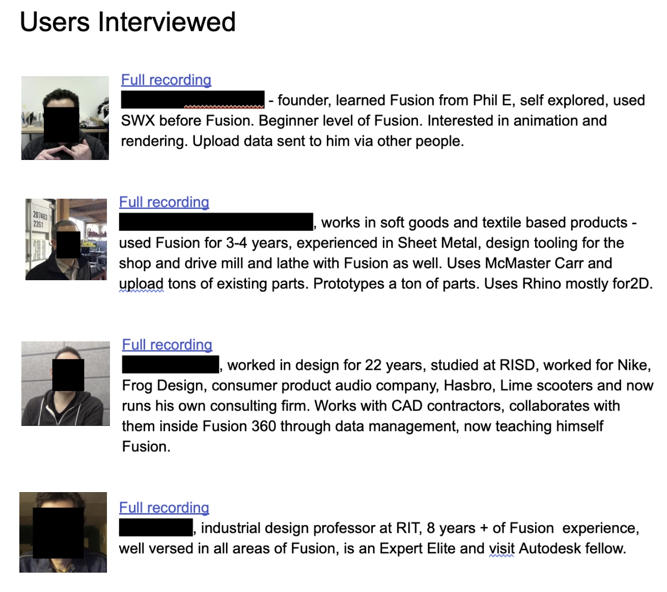
Participants
We interviewed four users with varying levels of Fusion experience. While additional participants would have been ideal, time constraints limited our sample size.
Hypotheses
Our usability sessions focused on validating the following hypotheses:
- Moving job status, service notifications, and product updates into a single Notification Center will provide users with a clearer, centralized point of reference.
- Adding a Flyout and Toasts is an intuitive approach aligned with users' mental models of notifications.
- The new Flyout and Toast workflow will not disrupt the user's workflow.
Key Findings and Observations
Current Experience
- Job Status Discovery: All four users were unaware they could access Job Status via the "clock" icon. One user relied on a cumbersome workaround through specific workspaces. Three users didn’t recognize the "View Job Status" text in the expanded dialog as clickable.
- Banners: Banners were not perceived as overly invasive but were sometimes missed. Users felt banners took up valuable screen real estate when noticed. The "What’s New" banner was the most noticeable and often left open for later review.
- Updates: Users valued knowing what an update included before installing it, especially for bug fixes or new features. Forced updates were disruptive when triggered at inopportune times.
New Concept (Notification Center, Flyout, Toasts)
- Overall Reaction: Users responded positively to the new Notification Center, appreciating the centralized location for notifications. Most users felt they could easily find what they needed, though one expressed concerns about potential clutter despite filtering options.
- Toast Notifications: Toasts were seen as intuitive and effective for confirming actions like downloads/uploads. All users successfully navigated from a toast to "View Details." One user initially thought an error occurred when a modal disappeared after clicking "Upload" but quickly understood the toast’s purpose.
- Flyout Functionality: The bell icon was universally recognized for alerts. Users understood that activities were sorted chronologically. One user suggested consolidating rendering jobs into the Flyout. The funnel icon for filtering was unclear to one user.
- Cancel Actions: Reactions to cancel functionality were mixed. Some users noticed individual file cancel options, while others only saw "Cancel All." One user noted that individual cancel buttons were too close together, increasing the risk of misclicks.
- Notification Persistence: Users questioned how long notifications would remain in the Flyout and what actions would remove them.
Outcome
These results gave me confidence to move forward with our MVP. We prioritized critical feedback—such as improving discoverability and clarity—for v1, while reserving enhancements like advanced filtering and notification persistence for v2.
Centralized Notification Guidelines & Figma Components
To ensure consistent usage, I developed comprehensive guidelines for the Notification Center and banners, which were submitted to the platform team and became a key resource for product teams. These guidelines clarified appropriate usage, including when and why to use each. In addition to the guidelines, I also created Figma components for other teams to use, making the notification guidelines easier to follow and consistent.
Development
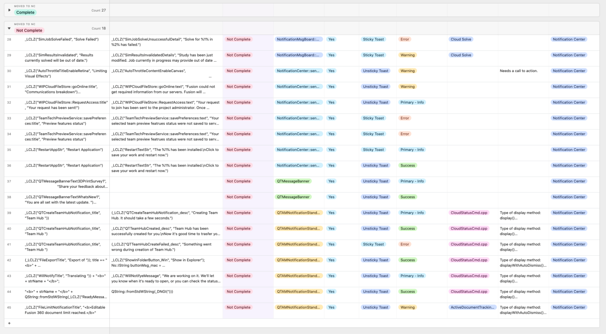
To streamline notifications, I advocated for a centralized front-end and back-end system, replacing inconsistent implementations. A code audit, organized in Airtable, identified existing notifications and tracked their types and progress. This facilitated collaboration with development, ensuring efficient and high-quality delivery.
“Jason was a great collaborative partner, leading our weekly meetings with fresh ideas and humility, ensuring we stayed aligned and on track. His work had a huge impact in centralizing in-product messages in Fusion’s Notification Center and improving how we organized critical updates for the user. As a developer, I really appreciated how well he bridged design and implementation.”
Alyssa, Sr Software Engineer, developer of notifications.
A Centralized Solution
My work successfully transformed Fusion's notifications from a source of user frustration into a strategic communication tool. I designed a centralized notification center that reduced user distraction, coupled with clear guidelines and prioritization strategies, demonstrably reduced user distraction and improved the overall clarity of in-app messaging. Resulting in an increase of 15,000 paid subscribers in the first month. The establishment of a scalable messaging framework and its integration into Autodesk's design system provides a lasting foundation for future product development and consistent user communication.