Team
Product Manager, 2 Developers
Stakeholders
Every other UX team, Business Group, Marketing
Tools
Figma, Mural, Airtable, Confluence, Jira
Autodesk Fusion is a cloud-based platform that integrates tools for 3D CAD design, manufacturing, engineering, and product lifecycle management, supporting the entire production process from concept to delivery.
I proactively identified the need to improve Autodesk Fusion’s notification system and formally proposed it as a critical project. I secured funding and stakeholder support, then led the end-to-end redesign and revamp of the notification system, including its guidelines and patterns. This initiative reduced user distraction, improved communication, and empowered product teams to design more consistent experiences more efficiently. As a direct result, the product saw 15,000 additional subscriptions in the first month after launch.
The Problem
User Experience
Inconsistent, overwhelming notifications disrupted workflows and created confusion.
Business Impact
Critical communications were lost in the noise, reducing subscriber growth and engagement.

Product Perception
Fragmented messaging hurt brand quality and user trust in the platform.

Internal Friction
Lack of a unified strategy increased development complexity and maintenance costs.
Goal
How might we design a notification system that reduces user fatigue while ensuring critical communications are visible, effective, and aligned with business growth objectives?
Discovery and Research
Discovery
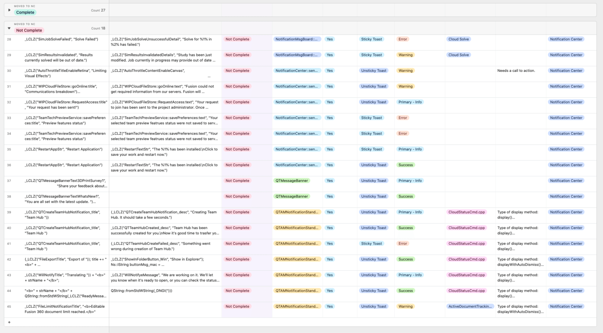
Conducted a content inventory of existing notifications, identifying patterns, redundancies, and inconsistencies.
Competitive Analysis: Examined notification strategies from internal products like AutoCAD and Revit, as well as external applications.
Research
Gathered insights from user forums, existing research, and discussions with other UX designers.
Identified recurring user frustrations including overuse and repetition of notifications, poor content quality, lack of user control and accessibility, and an overwhelming number of notification channels.
Found that banner notifications were frequently ignored, and OS notifications were inconsistent and underutilized.
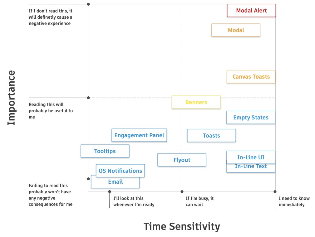
Framework Development
Developed a severity matrix to categorize notifications based on importance and time sensitivity.
Created a decision matrix to align notification types with appropriate delivery methods (e.g., toasts for high-severity alerts, flyouts for less critical messages).
Stakeholder Engagment
Secured funding by presenting the strategic value of the project to leadership, emphasizing how resolving notification issues would directly benefit both users and the business.
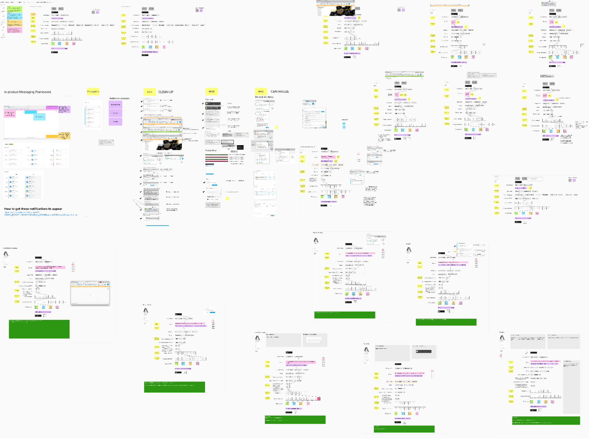
Design and Itteration
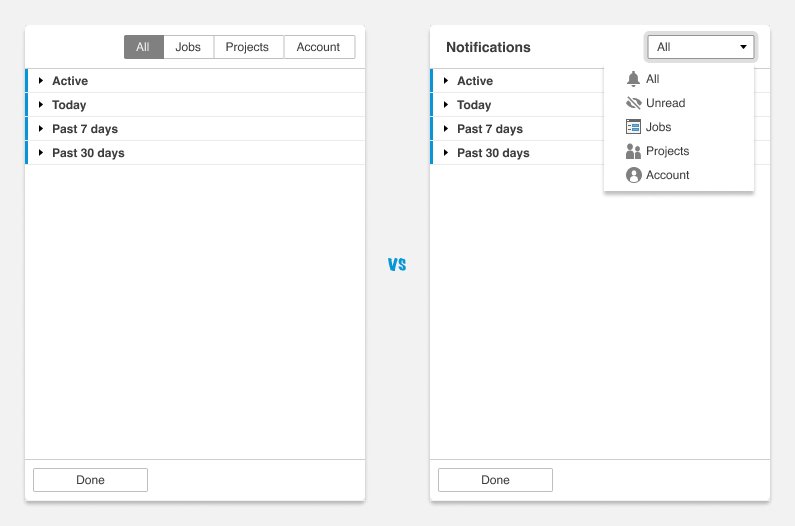
Scalability of Filtering and Organization
Problem: Early filtering solutions, such as tabs, quickly became unwieldy as more notification types were added. This threatened the long-term scalability of the system.
Iteration: I switched to a dropdown filter, which allowed for easier expansion and customization. Multiple rounds of prototyping and user feedback helped refine this approach to ensure it was both intuitive and future-proof.
Visual Clarity and Discoverability
Problem: Users struggled to quickly scan and understand notifications and icons. My goal was to create the ability to understand the notifications from a glance.
Iteration: I experimented with iconography, grouping by time, and contextual overlays. Usability testing revealed that some icons (like the funnel for filtering) were not obvious, prompting design tweaks and clearer visual cues.
Technical Constraints
Problem: Legacy systems and inconsistent backend implementations made it difficult to centralize notifications without breaking existing functionality.
Iteration: I worked closely with developers to audit the current system, track progress in Airtable, and advocate for a unified front-end and back-end approach. This required ongoing iteration as technical limitations surfaced during development
User Testing
Participants
Tested with 5 users with varying levels of Fusion experience:
3 power users
1 intermediate user
1 new user
Key Findings
Users responded positively to the centralized Notification Center, appreciating the ease of finding notifications.
Concerns included potential clutter and unclear filtering icons.
Users questioned how long notifications would remain in the flyout and what actions would remove them.
Outcome
The testing validated our MVP approach and helped prioritize critical feedback for version 1, reserving advanced features for future iterations. I made immediate adjustments to the filtering system and added clearer documentation about notification persistence.
Implementation
Guidelines and Components
Comprehensive Guidelines
Developed detailed documentation for the Notification Center and banners, ensuring consistent usage across teams.
Figma Components
Created reusable components to streamline implementation and maintain design consistency.
Development Collaboration
Code Audit
Conducted a thorough code audit to centralize notifications and replace inconsistent implementations.
Tracking Progress
Used Airtable to track notification types and progress, facilitating collaboration with developers.
“Jason was a great collaborative partner, leading our weekly meetings with fresh ideas and humility, ensuring we stayed aligned and on track. His work had a huge impact in centralizing in-product messages in Fusion’s Notification Center and improving how we organized critical updates for the user. As a developer, I really appreciated how well he bridged design and implementation.”
Alyssa, Sr Software Engineer, developer of notifications.
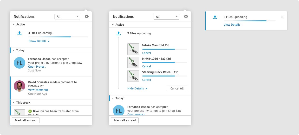
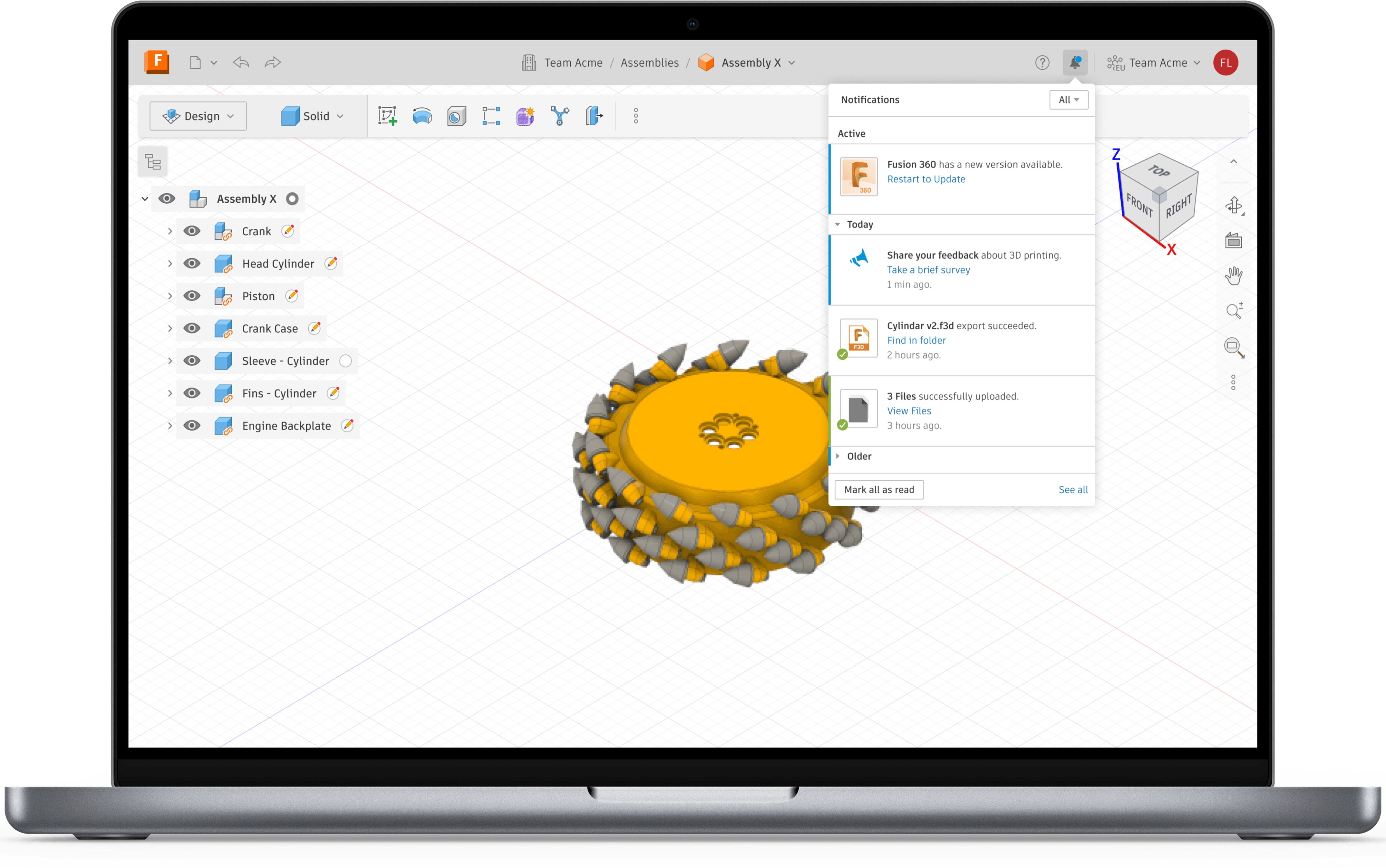
Centralized Notification Center
The final solution delivered a comprehensive notification system that balanced user needs with business requirements.
Implemented a centralized Notification Center with clear guidelines and prioritization.
High-severity messages appear as toasts; less critical ones in a flyout.
Intermediate messages briefly toast, then move to the flyout.
Reduced workflow disruption and improved message clarity.
Key Features
Severity-based display
Customizable filters
Bulk actions
Read/unread states
Category organization
Action buttons
High Severity
Critical alerts appear as prominent toasts requiring immediate attention.
Medium Severity
Important but non-critical notifications briefly toast, then move to the flyout.
Low Severity
Informational updates appear only in the notification center without interruption.
Results & Impact
The redesigned notification system delivered significant business value and improved user experience.
In the first month after launch, directly attributed to improved messaging and user experience.
Scalable Framework
Streamlined product development and reduced technical debt.
Clear Design Patterns
Empowered internal teams and improved consistency.
Design System Influence
Key elements incorporated into Autodesk's Weave design system.
Professional Growth
This project established me as the in-house notification expert and mentor for other designers. I was invited to present the framework at Autodesk's internal design conference and received recognition from senior leadership.
Key Learnings
This project provided valuable insights that have shaped my approach to UX design.
Unified messaging is essential
A cohesive notification strategy is critical for user satisfaction and business growth.
Iterative design is key
Research-grounded, iterative design with stakeholder alignment is crucial for complex systems.
Reusable components foster consistency
Providing guidelines and components ensures consistency across different teams.
User understanding drives impact
Deep user understanding through research and analytics leads to impactful solutions.